Thursday, March 26, 2020

The Failure of the US Government: The US Now Leads the World in the Number of COVID-19 Cases


In another post, I noted that that within 24 hours the US would surpass all other nations in the world with the largest number of COVID-19 cases.  I was wrong, it happened this afternoon (link). The US now has more cases than China where the coronavirus originated. 

Why are there so many cases in the US? Afterall, the coronavirus did not originate in the US, nor was it transferred here by foreign nationals from China, Iran, or other countries. The first people testing positive in this county were US citizens. Early infections on the West Coast were US citizens who had traveled to the Hubei Province in China. And on the East Coast US travelers to Europe and the Middle East brought the coronavirus back with them. Although a travel “ban” was in effect, US citizen were free to come and go from the country.  On March 11, President Trump unexpectedly instituted a travel ban on another 26 countries in Europe (link).  But by that date, March 11, more than 1600 people around the US were already infected with COVID-19.  None of the travel bans had any effect on reducing the spread of the disease in the US. (link)

What it didn’t do, according to experts, was help abate the spread of coronavirus in the US. . . .  public health experts say that once a disease has begun circulating within a community, banning outsiders is mostly futile.

Why are there so many cases in the US today? The answer is simple. Failure of leadership. At the outset, the US government failed to convey the seriousness of the disease to the American people and even contradicted public health experts, epidemiologist, virologists, and other scientists who were providing factual information. US government officials were not providing medically accurate information about this pandemic disease, its health implications, or its potentially fatal nature. Ignoring the public health crisis, the rhetoric focused on the economic effects of the outbreak.

Also, at the outset, the US government failed to provide trained pandemic teams that could help local official cope with the first few initial cases. These teams could have assisted with proper infection control protocols. They also could have helped with extensive contact tracing to try and stop the spread of the coronavirus at the local level.

Adding to the failure, was the lack of adequate testing. Without a robust testing program many infected individuals were not detected. Early testing kits were flawed, but when accurate test kits were available, it took several days for confirmation by the US Center for Disease Control and Prevention (CDC) to change the status of a “presumptive case” to a “confirmed case.” Meanwhile, those “presumptive cases” were sent back home to “self-isolate” while waiting for test results from the CDC. Given the contagious nature of this coronavirus how many “self-isolating” individuals spread the infection among household members? We will never know how many cases of “community spread” resulted from “self-isolating” individuals in the US.

On of March 5,  less than 1500 COVID-19 tests had been administered across the country (link). According to the COVID tracking project, a website that tracks the actual number of positive and negative COVID-19 tests, on March 5, 2020 only about half of the US states had access to tests. Epidemiologists will later provide a retrospective estimate of how many actual cases were missed between January 21, 2020 and March 5, 2020 because of the lack of testing. 

The US outbreak could have easily been contained in the beginning. On February 18, four weeks after the first case was detected in Washington state, there were only a total of 13 confirmed cases in the US in nine different counties in five states, Arizona, California, Illinois, Massachusetts, and Washington.   With this small number of cases in only a few locations, the US could have implemented aggressive isolation of infected individuals at these locations.  The community spread of the disease across the country was a result of testing failures and lax enforcement of isolation protocols, protocols that could have save thousands of people from the infection and hundreds of at-risk individuals from death. 

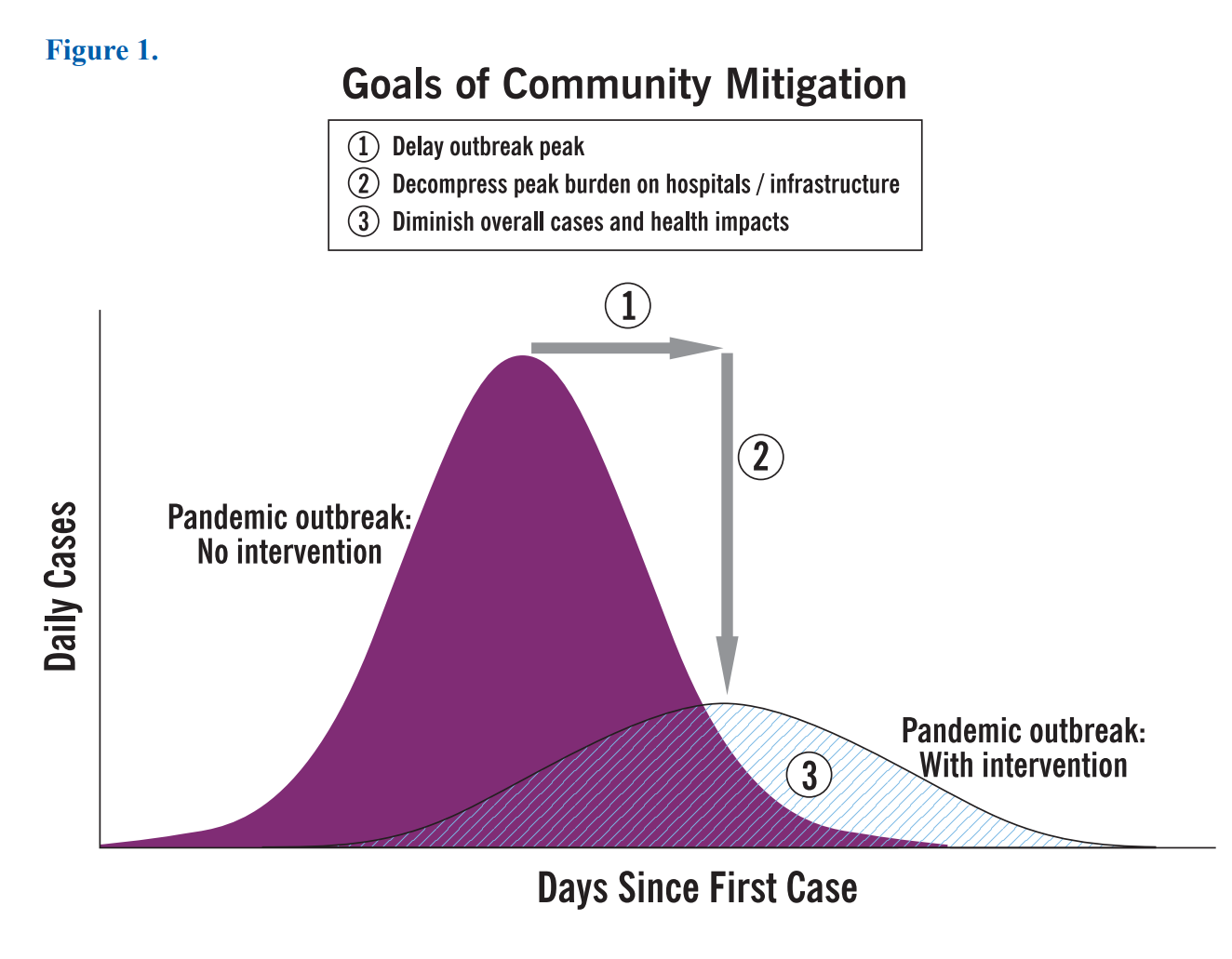
Also, US government officials failed to explain and warn the public about the consequences of not “flattening” the epidemic curve (link). Because the US failed to implement a vigorous program of self-distancing, limiting gatherings of large groups, etc., the curve has not flattened.  Across the US there is now a severe shortage of hospital beds, ventilators, and other medical supplies necessary to treat the growing influx of COVID-19 patients. That is compounded by the fact that health care workers have not been provided with an adequate supply personal protective equipment. Even health care workers are now at extreme risk of contracting the coronavirus.

There is no reason to believe that parameters of the COVID-19 pandemic are going to substantially change in the next few weeks. Fear, turmoil, sickness, and death will be the companions of every America during the next few weeks.

Tuesday, March 24, 2020

What Does Flattening the COVID-19 Curve Mean?


There has been a lot of discussion by government representatives, media, and public health experts about flattening the curve to limit the strain on health care services during the COVID-19 pandemic. The discussion surrounding flattening the curve dates back to about 2007 (link) and the original CDC chart is reproduced below. Additional history about the evolution of this chart to a recent animated gif by can be found at this link.


While the concept of flattening the curve is simple, the general public is being bombarded with graphical representation of the ever-increasing cumulative number of COVID-19 cases around the world and in their own countries. Here are several immediate examples of tracking sites on the internet with graphs plotting the total cumulative cases from around the world.

Usually, the main graphic image is a line graph or histogram showing the changing total number of COVID-19 cases by day. Technically, this type of graph is referred to as an ogive, a graph that display cumulative data usually over a period of time.

Cumulative Frequency Graph (Ogive)

An ogive is a graphic presentation of incrementally increasing cumulative data usually over periods of time. This kind of graph is mostly used to depict progress to specific goal or end point. For example, if a company sets a target goal of selling 10,000 units starting in January how low long will it take for sales to reach the 10,000-unit threshold. The graph below shows that monthly sales surpassed the goal of 10,000 units in August.


Another example might be a charity trying to raise $8000 for new playground equipment for a youth center, as depicted in the graph below. In this graph the x-axis is not time, but the remaining distance to achieve the goal of $8000.


Now consider an ogive, a cumulative frequency graph, of COVID-19 cases below which is from KFF, a non-profit organization concerned with national health issues. It shows the cumulative growth of COVID-19 cases through MARCH 24, 2020. But is such an ogive curve appropriate for a disease outbreak? By using an ogive, do we have some set goal of the number of COVID-19 cases we are purposefully trying to reach? A million cases? 10 million cases? No, of course not.


At the beginning of a disease outbreak, a cumulative frequency graph can reinforce the public message that the outbreak could get worse. The COVID-19 outbreak did get worse and it evolved into a pandemic. At this stage of the pandemic the cumulative frequency graph of COVID-19 cases has lost it informative powers. Everyone is already aware that that cases are continuing to grow. There is no other message that it conveys.

A distinctive feature of an ogive is that it can never go down. From a pandemic perspective, even after people stop being infected, the graph will never go down nor will it go back to zero. Thus, when public health officials talk about flattening the curve, they are not talking about an ogive of COVID-19 cases that is prominently displayed across the internet. These officials are talking about flattening the epidemic curve.

Epidemiological Curve

An epidemiological curve, often referred to as an epidemic curve, is a graphical representation of the frequency of new cases over time based on the date of onset of disease, usually depicted as a histogram. Epidemic curve are always graphed against time. A true epidemic curve is a plot of the number of new daily case based on date of symptom onset. The significant difference between an ogive of COVID-19 cases and an epidemic curve is that only new cases are plotted on a daily basis, not the new cases plus the total of all the cases that occurred before that date.

Below is an epidemic curve for the United State Center for Disease Control and Prevention (CDC). From the low number of plotted cases in the graph, it should be obvious that the CDC does not have onset dates for the vast majority of US COVID-19 case. The graph notes that the number of daily new cases from the past few days will change because onset of symptoms can occur from a few hours to several days before the case is confirmed and added to the tabulation. In terms creating the graph, onsets dates almost always happen in the past.


The most significant information component of an epidemic graph is that an inflection point in the curve is almost immediately identifiable.  The inflection point is the point in time when the number of cases stops increasing and begins to decreases. When public health officials talk about flattening the curve, they are referring to implementing interventions that will reduce the overall shape of the epidemic curve, particularly at the inflection point, by reducing the maximum number of daily cases based on onset of symptoms.

Comparison of an Ogive with an Epidemic Graph

The graph below plots both a cumulative frequency of cases against a number new daily cases. Based on the discussions above, it should be clear as noted on the chart that the line graph of the cumulative frequency graph will never go down.


Even though the general public does not have access to the symptom onset dates of confirmed cases, a psuedo-epidemic graph can be constructed from available data. Rather than plotting cases by onset dates, a pseudo-epidemic curve can be graphed based on the number of newly reported cases on a given day. Such a graph is a reasonable approximation of the underlying epidemic curve.

The comparison of the ogive and the epidemic curve presented above is not hypothetical. It is the cumulative daily total of COVID-19 cases plotted against the pseudo-epidemic graph of the daily new COVID-19 cases for the Republic of Korea (South Korea) as shown in the full labelled graph below. What the epidemic graph or curve clearly shows is that about March 2, 2020, South Korea passed an inflection point and the number of COVID-19 cases starts to decline. Through aggressive intervention South Korea was able to flatten the curve during the first few days of March when the number of new cases started to decline. South Korea is currently on its way to economic and social recovery.


While ogives, cumulative frequency graphs, of the COVID-19 pandemic serve to present dazzling graphics - some static and some animated - it is epidemic curves that will shows the true progress of the disease in a particular country or the world as a whole. That is the curve that needs to be flattened. 


Note: The South Korea data in the epidemic graph above was obtained from DS4C: Data Science for COVID-19 in South Korea.